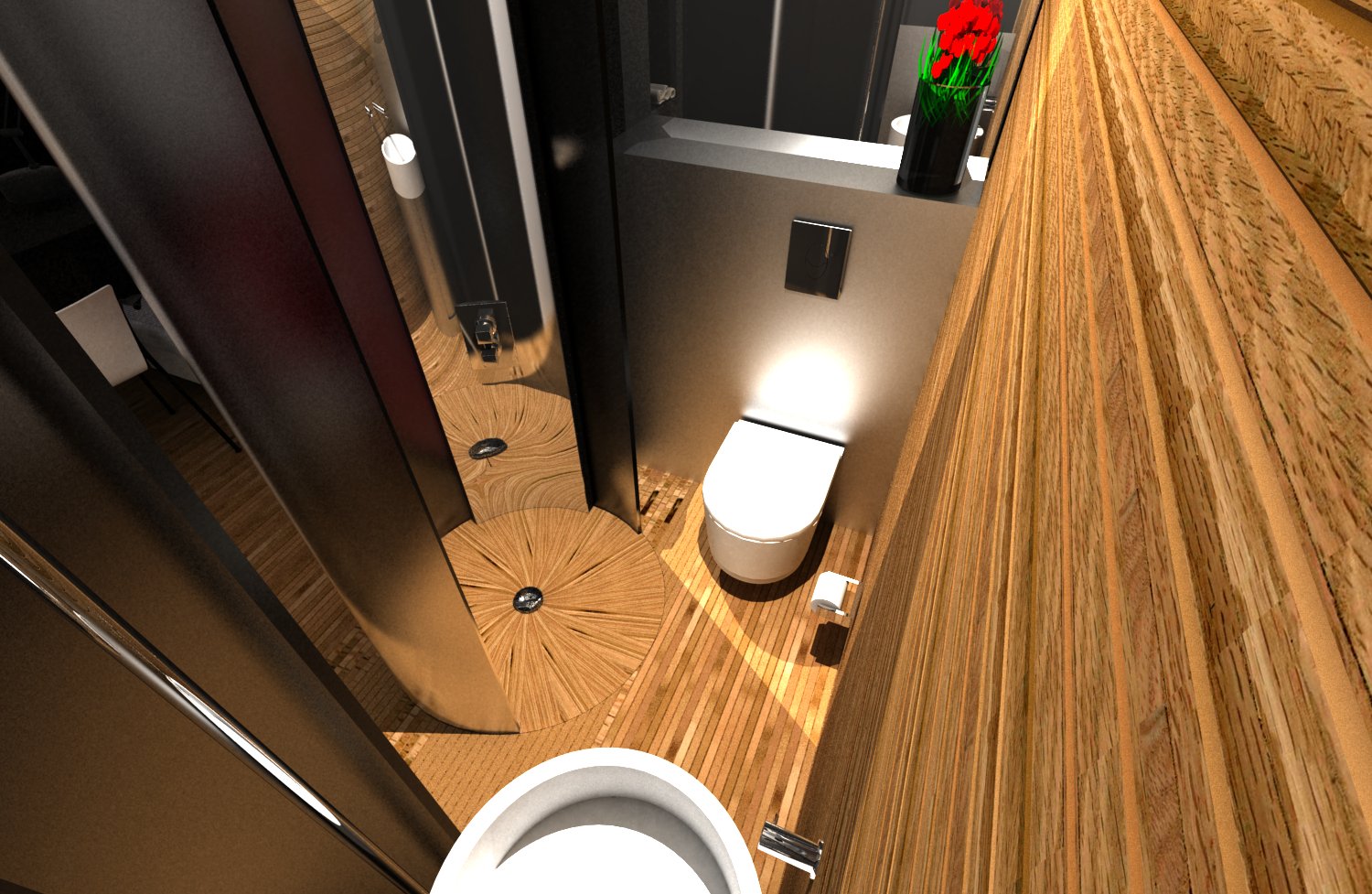
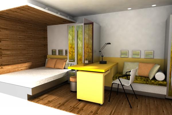
We were asked by our clients to investigate the shortcomings of hotel accommodation fit within standard shipping containers. With that research we aimed to improve on the current crop of container accommodation by concentrating our design efforts on the quality of the room itself, rather than specifically responding to the nature of the room container. After all, does a guest at such an establishment want or need the constant reminder that he is living in a cheaply made tin box primarily designed for shifting industrial goods? We have taken the approach that a containerised room can be playful, and can respond to the spirit and location of where it is placed, or perhaps where it has come from. With “Fresh Face” we have captured the cool lime - fresh vitality that might refresh a desert weary contractor returning home of an evening. A sort of Gin and Tonic with a twist of lemon! Whilst with “Warm From Home” we have taken the idea of creating a high quality environment with timber floors walls and ceilings creating a suite that is warm and enveloping. Reminiscent of, if not exactly like, your own home. Technically of course, the suites also deliver. We have managed to squeeze out a couple of extra cubic metres of volume over those of competitor designs, by using clever internal cladding details. They also help to keep weight to a minimum. Our designs also perform environmentally and would be classified as super insulated. Spatially however is where the suites deliver most. The rooms or zones that are comfortable, functional, efficient, and yet uncompromising in their beauty.
Boston Place terrace house in London’s Marylebone district
This terrace house in London’s Marylebone district once belonged to a product design guru from the 1970s but it had seen better days. Set within the Dorset Square conservation area the external form and materials of the building could not be changed, but the interior construction had to be completely demolished and rebuilt. We used a combination of conservation and contemporary construction techniques to recreate the house with exceptional environmental performance allowing sustainable living in with no compromise in comfort. The butterfly roof form was retained but a new roof structure allowed it to be revealed inside providing character and much needed additional volume, light and air. In turn, this allowed an adjustment of the the first floor level which gave the downstairs and upstairs rooms a much better proportion. The canvas for an an elegant interior design was set. Central to the success of the design is the tiny external courtyard – priceless in this dense central location. Treating the courtyard as an external room, or an extension of the open plan living space, suggested a movable glass screen that when opened blurred the boundary between inside and out. There is a monochromatic theme to the finishes; black and white on the ground floor and pure white upstairs save for the showeroom which is darker more intimate. This is followed through to the bespoke furniture and joinery items in various shades of white. The resulting house is light and airy, and feels much bigger than it actually is..
The Bramptons Housing Project
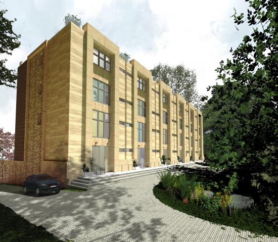
The Bramptons is a high-end residential development consisting of a terrace of six large townhouses, and six detached houses. The development is set within a walled garden containing many mature trees. Each of the townhouses can be subdivided into smaller dwellings that will form flats or interconnected apartments. The townhouses are formally arranged to address the street giving the property a strong and elegant presence in the locality. To the rear the elevations are less formal addressing the smaller detached mews houses, each set into the landscape as it falls away. By using the topography of the land, all the properties enjoy impressive views over the beautiful Pendle Hill and its surrounding countryside.
Concept Bridge New Islington Manchester
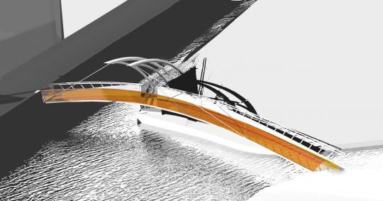
The competition brief asked for a design proposal for a bridge that addresses practical issues such as budget, access levels and local planning and building interests, while at the same time create an inspirational and world-class architectural landmark.
Of the many options Linedota researched, the final recommendation is a stunning combination of the practical and the fanciful. Its curving and tapering edge beam supports, its cantilevered steel arches, suspension cables and use of materials such as light-reflective aluminium and yellow glass, all contribute to a construction that is as strong as it is sleek and sunny. Its centrally supported design meanwhile is inspired by an Indian superstition. Believers claim that a small basket of trinkets hung from a single pole and suspended over water will find favour with the gods and so has the power to make dreams come true – a perfect theme for the bridge and people of New Islington.
Flatpack School House Design
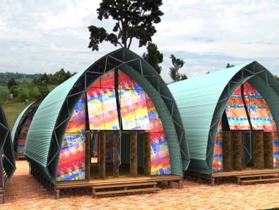
What would it be like if a schoolhouse cost less than a second hand car to build, say less than £5000? And yet the building provided high quality facilities for up to 45 children in villages in some of the neediest countries in the world. The buildings would obviously need to be quick and simple to build by local people, be earthquake safe, cool inside, long lasting, and fully recyclable at the end of their life. The buildings should also be carbon negative using only solar power. Such a building does not exist yet, but when it does it will look like this. A charity project designed and launched by Linedota Architects with generous assistance from Professor Stan Guidera and students from the Bowling Green State University USA, Villian Wing-Lam Lo of the University of Cambridge, and staff and students from the University of Nottingham. Internal images by Martina Kueng, further modelling by Alexander Panlilio.